Your syntax highlighter is wrong
As coders, we spend our working lives looking at code. We want that code displayed legibly and beautifully. One tool that is supposed to help here is ‘syntax highlighting.’ Text editors, web viewers, and command-line tools do it. We’re so used to syntax highlighting that it can be jarring to then look at the code in uniform black-on-white.
But what things should we color, and with what colors? This decision initially seems superficial. But the syntax highlighting that we choose makes important value judgments about our code. Some dubious ideas are implicit in those color themes, and those dubious ideas are perpetuated by the continued use of those themes. In this post, I take two of those dubious ideas, show how our syntax highlighters reinforce those ideas, and suggest how to change them.
1: ‘Comments are cruft’
In Clean Code, Robert Martin writes that ‘A comment may be used to amplify the importance of something that may otherwise seem inconsequential.’ Martin provides the following example:
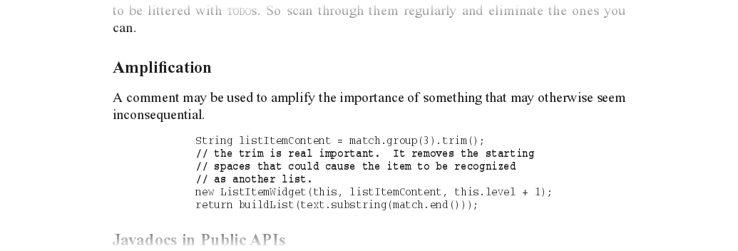
Martin writes that ‘the proper use of comments is to compensate for our failure to express ourself in code.’ It’s there to shout out about something that the code fails to tell you. The comment needs some help to distinguish itself from the surrounding code and say, ‘hey, I’m important!’ Notice that the comment in Martin’s book is appropriately in boldface. Now, let’s look at that same code on GitHub’s code viewer:
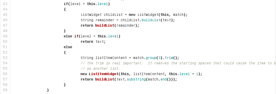
The comment is washed out. While the rest of the text exists in black, boldface, and bright colors, the comments fade into the background. I’m not picking on GitHub here; the same approach is taken by virtually every highlighting scheme. The implication is obvious: the comment is less important than the code. As a consequence, our eyes skip directly over the comment and it goes unread. This runs directly counter to the Clean Code approach to commenting. What should that comment look like? If Clean Code were in color, it might look more like this:
So why is it that we have collectively decided that comments should be almost invisible compared to the code? I think it’s because of the very thing that Martin rails against: the prevalence of redundant, obese comments. Here’s his example:
Every comment here is redundant. Worse, the textual decoration attempts to assert its own importance, adding two non-semantic lines to every comment. And indeed the eye is drawn to the useless comments instead of the code. So, after looking at these useless comments all day, what do we do? We use our syntax highlighter to turn them off! Here’s GitHub again:
Now, what would happen if we were to use my suggested color theme for those comments? It’s going to be ugly, right?
Damn right it’s ugly! It should be ugly! Get rid of those comments! The obnoxiousness of those useless comments forces us to improve the code. After removing all the comments except the useful ones, I was left with this:
The few important comments that remain no longer get lost. And we simultaneously made the code shorter. 127 lines reduced to 21 lines: an 83% line reduction! Our syntax highlighters validate the Javadoc comments-everywhere philosophy that we wish to eradicate, and punish those who attempt to write clean code. I believe our commenting would be better if we changed our syntax highlighters to reward such good behavior.
2: ‘More is better’
Here is the commit on GitHub in which I removed all of those comments:
Notice anything? That’s right: it’s in color! In GitHub’s diff viewer, and in every other diff viewer in the world, a red line is one that was deleted, and a green line is one that was added. As a consequence, most of the commit in which I removed those comments shows up in red.
I shouldn’t need to tell you that red and green have another important meaning: red means bad and green means good. This association is cross-cultural, probably universal, and probably as old as the hills: red as blood, green as grass. [Edit: chucker23n, kens, and other commenters point out that this association isn’t so universal after all; however I suspect it’s fairly universal in programmer and web culture.] Danger is red; safety is green. Errors are red; successes are green.
Our diff viewer, then, tells us that deletions are bad, dangerous, and possibly an error, while insertions are good, safe, and successful. More code good. Less code bad. [Edit: multiple people have suggested a different interpretation: old code bad, new code good. However, since that would be a similarly invalid value judgment, the argument below is still valid.]
But we all know, and we’ve all known for a long time, that less is more. ‘The best code is no code at all.’ ‘I have made this function so long only because I did not have the time to make it shorter.’ More code equals more bugs. Following Heartbleed, we’ve taken great pleasure watching the OpenBSD team obliterate entire portions of OpenSSL for the greater good. Why, then, are we psychologically rewarding additions with green, and punishing deletions with red? Shouldn’t we be doing the exact opposite? I believe the reason for this strange color scheme is the lack of a revision control system. Back in the dark ages of programming, we didn’t use them. We edited files on disk, and that was that. In that environment, a deletion is dangerous. If you decide you want it again after you delete it, well, that’s tough. In contrast, insertions were comparatively danger-free: if you want to undo that insertion, you just remove it again. Outside of writing code, we are still faced with this dilemma today. Are you sure you want to empty that recycle bin? Do you really want to delete those rows from that table? Careful with that ‘rm -rf’! In a world without revision control, deletion should be red and insertion should be green.
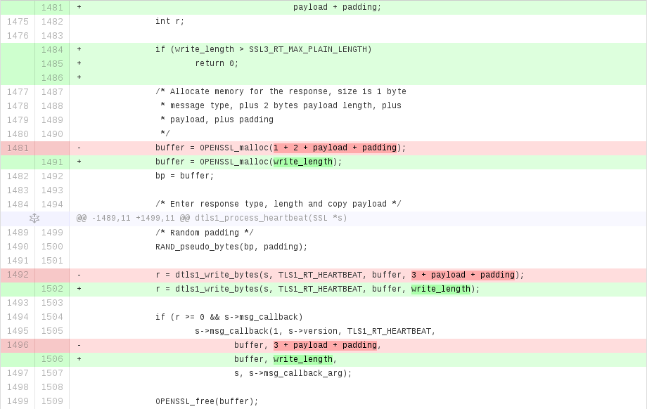
But we don’t live in a world without revision control. It is peculiarly ironic that the ‘deletion is dangerous’ sermon is being delivered by our version control systems. That same revision control system which tells us that ‘it’s okay to delete things, because it’s all still there in the history.’ In reality, insertion/deletion is orthogonal to good/bad. There are good insertions, good deletions, bad insertions, bad deletions. Only we humans get to judge which changes are good and which are bad, but during code review, the diff viewer is constantly subtly trying to influence our judgment. It should be getting out of our way, using neutral colors to distinguish insertions from deletions but make no value judgement about them. Here is GitHub’s diff viewer showing part of the fix to the Heartbleed bug:
Now here is the same diff using value-neutral colors:
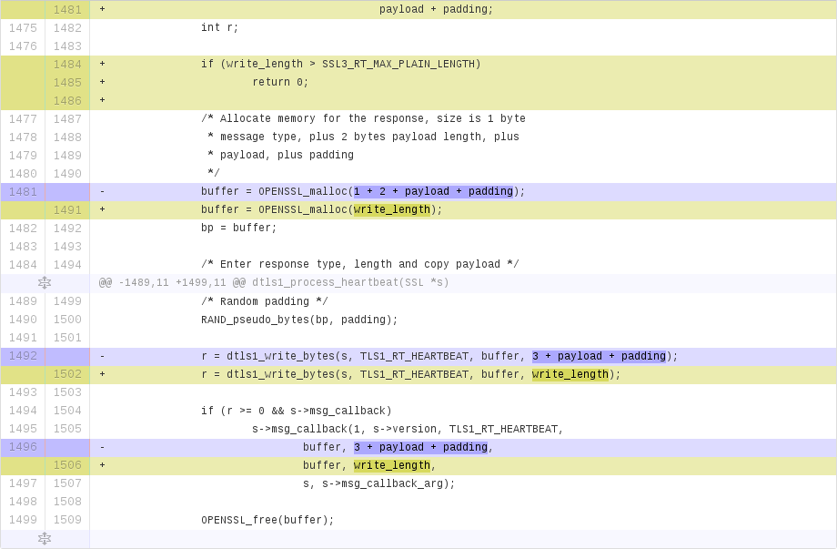
Perhaps it’s not as pretty, but it’s more usable. [Edit: quite a few people disagree. I suggest it would take some time to retrain your eye.] The colors are now purely semantic. Neither blue nor olive have any strong associations with value, but they’re clearly distinct. They distinguish between insertions and deletions, and nothing more. So, our existing diff viewers make value judgments where they shouldn’t, and what’s worse, they make inverse value judgments. We could improve our review processes at a stroke by changing the highlighting colors that they use.
Conclusion
I have identified two important kinds of value judgment - important vs. unimportant, and success vs. failure. I have showed how these judgments are made by our existing code highlighting themes: comments are hidden as unimportant, and deletions are displayed as errors. These judgments intrude on and influence our own thoughts and judgments. Further, I demonstrate that the judgments made by our existing color themes are the polar opposite of those that we wish to convey: comments are important, and deletion is neither dangerous nor improper. I suggest historical explanations for our current situation, and show that rectifying it is actually extremely easy.
Discussion
Further reading
Evan Brooks’ article ‘Coding in Color’ and Linus Åkesson’s article ‘A case against syntax highlighting’ both suggest ideas for semantic highlighting over syntactic highlighting.
The ‘Rainbow delimiters’ idea shows what can be achieved when upgrading our syntax highlighters from regular languages to context-free or context-sensitive ones. In my opinion, all languages should have this. (How many times have you searched through XML for the corresponding close tag?)
This article was previously published here.
This page copyright James Fisher 2014. Content is not associated with my employer.
 Granola